Monday 30 April 2012
Piers Harrop: 1030 Centre:64680
Dear Examiner, this is my media project for G322. Below is my film and the planning and processes that were involved in creating my final product. I created my film with George Thornton and Karen Tsang. I hope you enjoy my finished product.
PRELIMINARY
Our
preliminary task was to create a short sequence which includes a short
reverse shot combination. In order to gather ideas my group brainstormed
these in a powerpoint and this is our final decision.

To
film our short sequence we used an Iphone 4 to show that we can use
many different media devices to film footage including phones. Many
phones these days have similar or even possibly better picture quality
than standard film cameras.
Below is our video:
Below are screen shots of us editing the footage, cutting and ordering the footage into our desired sequence.

The screenshot below shows how we managed to increase the picture frame size of our footage in order to enlarge the footage and make it larger.

Saturday 28 April 2012
Research on film titles
Before my group and I create or film tile, we had a look
at different films to see how they made use of font, texture, background
and space. Here are some examples.
Through researching other title sequences we noticed that other film sequence fonts were often kept simple, bold, in contrast with the background and often shaped into the landscape.


Research on fonts


We went on
Dafont to look for the suitable font for our title. They all belong to
different categories, for example like handwriting, modern, destroy, horror and
gothic.
However my group
and I chose to focus on the handwriting genre as we thought it suits our film
the best.
Friday 6 April 2012
ART OF THE TITLE
We visited www.artofthetitle.com to see how other films in our genre organised their title sequence.
Below are some of the examples we looked at:
PANIC ROOM-

THE NEGOTIATOR-

SHERLOCK HOLMES-

SWEENEY TODD-


Below are some of the examples we looked at:
PANIC ROOM-

THE NEGOTIATOR-

SHERLOCK HOLMES-

SWEENEY TODD-

Through researching other title sequences we noticed that other film sequence fonts were often kept simple, bold, in contrast with the background and often shaped into the landscape. As a result we have kept our font simple, and shaped it into our scenery for example a wall. The titles also appear to be posed in different positions and often animated. Although we have placed our titles in different positions on the screen, we have decided not to animate our titles as we want to create a feel of realism to help make our film opening as realistic as possible without being a drama. This will help create suspense and familiarity and emotion within our audiences.


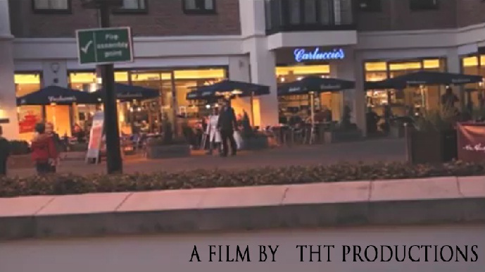
Our title sequence
Subscribe to:
Posts (Atom)